Explorer sidebar
As you can see, most of the actions in the explorer level are performed by the user using the sidebar element.
This component is located at Content/UI/SideBar.
The sidebar consists of multiple components, including buttons that are always displayed on the left side. These buttons come in two types: a square button with rounded corners, which represents actions within the sidebar.
Lastly the sidebar you can hide and show at will is implement inside the WB_SideBarContent
Sidebar Buttons
To simplify development, the CPP_SideBarButton class was created in the Source/Widgets/Buttons folder. The main purpose of this class is to implement reusable button logic, allowing each button to be customized with different icons and border colors.
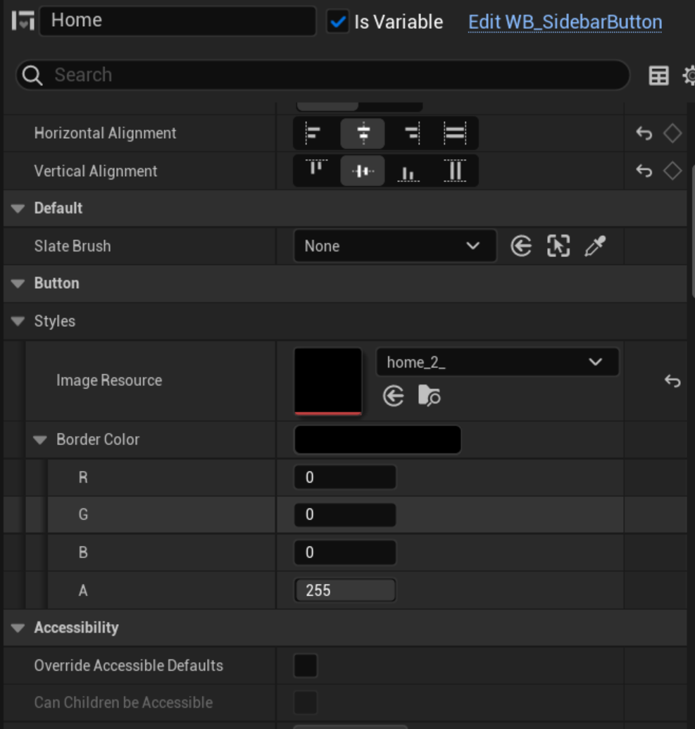
A Blueprint based on the UCPP_SideBarButton class was created inside the UI/ReusableButtons folder. Named WB_SideBarButton, this Blueprint provides a reusable button design.
Here are the steps to use this reusable button:
-
In the User Widget Blueprint editor of your choice, place the
WB_SideBarButtoncomponent. By default, it includes a placeholder icon with a black border. -
In the Details tab, specify the icon and, optionally, the border color for this button.
-
Once placed, set the button as a variable, allowing you to implement its on-click event within the User Widget component's Blueprint editor.
If you're unsure about these steps, refer to the WB_ExplorerSideBar Blueprint for example implementation.