Sidebar
As you can see, most of the actions in the explorer level are performed by the user using the sidebar element.
This component is located at Content/UI/SideBar.
The sidebar consists of multiple components, including buttons that are always displayed on the left side. These buttons come in two types: a square button with rounded corners, which represents actions within the sidebar, and a fully rounded button, which controls the visibility of the sidebar (showing and hiding).
Lastly the side bar you can hide and show at will is implement inside the WB_SideBarContent
Sidebar Buttons
To simplify development, the CPP_SideBarButton class was created in the Source/Widgets/Buttons folder. The main purpose of this class is to implement reusable button logic, allowing each button to be customized with different icons and border colors.
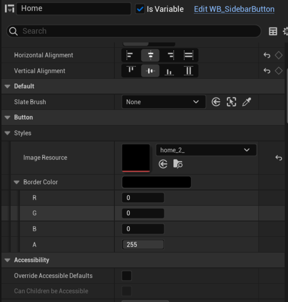
A Blueprint based on the UCPP_SideBarButton class was created inside the UI/ReusableButtons folder. Named WB_SideBarButton, this Blueprint provides a reusable button design.
Here are the steps to use this reusable button:
-
In the User Widget Blueprint editor of your choice, place the
WB_SideBarButtoncomponent. By default, it includes a placeholder icon with a black border. -
In the Details tab, specify the icon and, optionally, the border color for this button.
-
Once placed, set the button as a variable, allowing you to implement its on-click event within the User Widget component's Blueprint editor.
If you're unsure about these steps, refer to the WB_ExplorerSideBar Blueprint for example implementation.
Rounded Button
The rounded button is created similarly to the sidebar button, but since its only function is to show or hide the sidebar, its implementation is less customizable.
This button’s functionality includes a simple animation and logic to determine whether the sidebar is hidden or shown. Based on these factors, the animation plays forward when the sidebar opens and backward when it closes.
Note: Forward and backward animation play is used for most UI component animations. When a UI component should appear, its animation plays forward; when it should disappear, the animation plays backward.
The rounded button also includes a custom dispatcher, which the WB_ExplorerSideBar component listens to in order to perform the sidebar’s open/close actions.