Landing Page
For this part of the documentation, we will provide a brief overview of the design phases of the UI implementation for the Landing Page, as well as choices made along the way and how components function.
The design of the application is based upon the figma design which can be seen here.
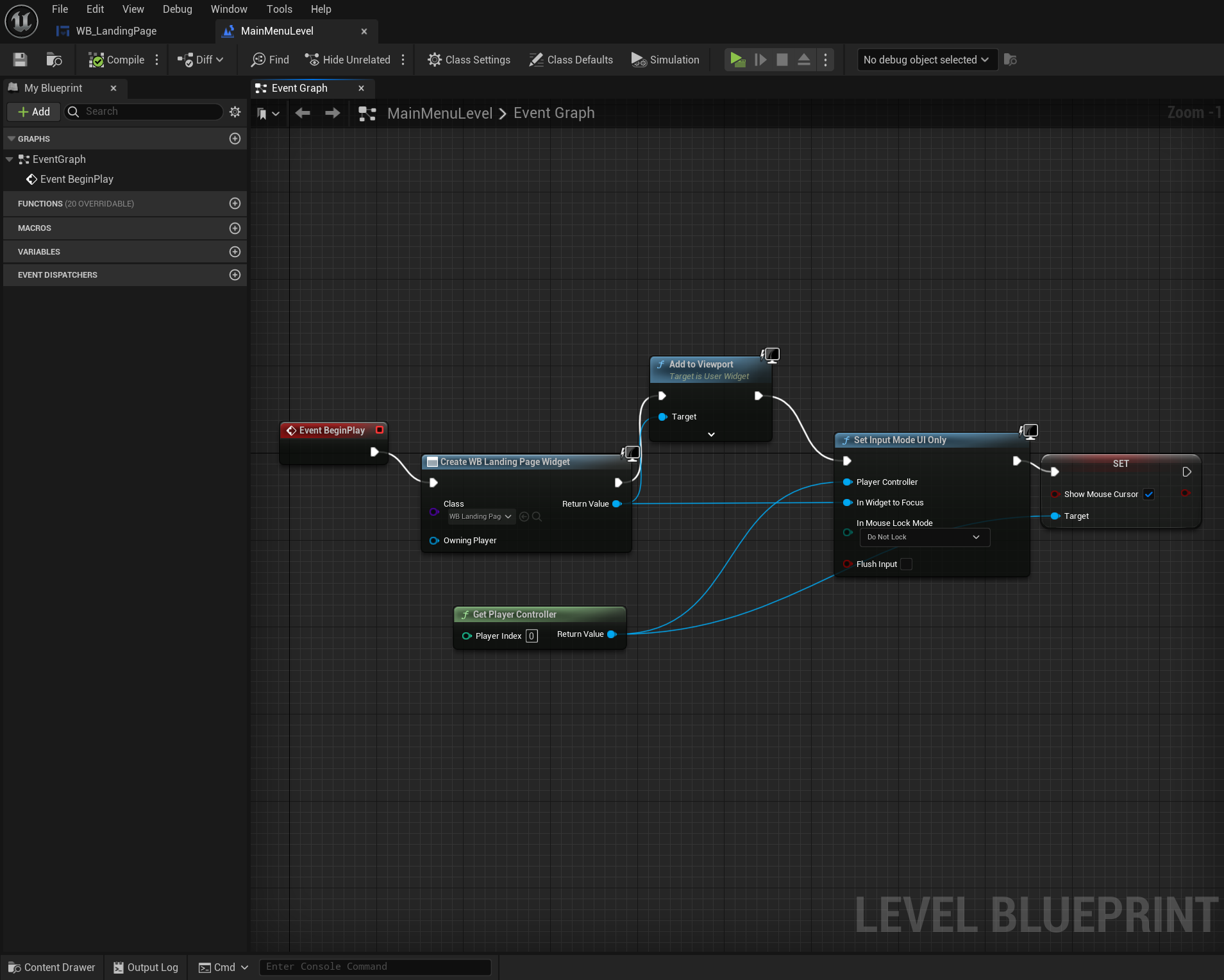
First we set the new landing page to be used by the MainMenuLevel in the MainMenuLevel blueprint.

Withing the landing page, every element is anchored to the canvas panel. This is done in order to keep the application responsive. By anchoring elements to the canvas, they essentially stick to a certain chosen point on said canvas. In the following example, note that the "Explorer Button" is anchored to the center of the canvas (depicted by the flower looking icon). (images/anchor-elements-example.png)
UI Structure and Resources
All UI elements besides the Level components are kept in the UI directory.
In order to match the Figma design, custom fonts are used which can be found in the "Fonts" directory.

A new directory for assets was created, named "Assets". This contains general assets such as design elements, as well as button assets acting as icons.
Reusable Buttons
For the sake of efficiency reusable buttons have been created.
RectangleBase
The rectangle base consists of three simple elements: overlay, button and text block, in that hierarchical order.
To actually make this button reusable, it is necessary to declare the text block as a variable in the Designer tab of the UMG panel.
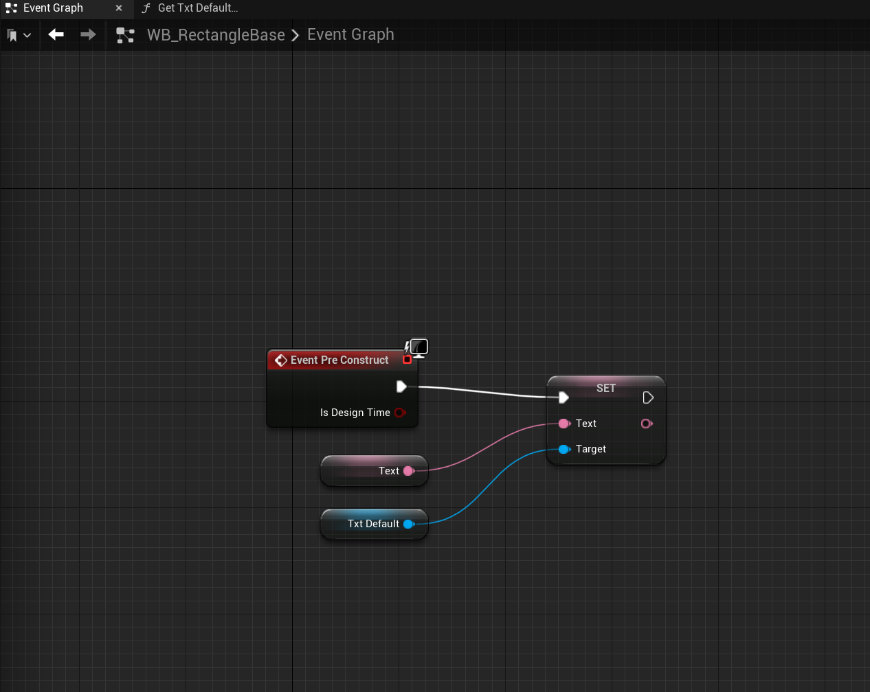
In order to be able to edit the text for the button in the UMG panel, the event has to be pre-constructed. After which, with a simple setter function we get the previously assigned text variable named txtDefault and pass it into the setter function. Finally, we pass the Text variable with type text into the setter function so that we can dynamically chnage it.

Now that we have a reusable button, we simply navigate to our landing page's widget blueprint and search for our button underneath the Palette tab in UMG.
Once we have added our button to the hierarchy, we can change the text to whatever we like from the Details tab.
SquareBase
The square base is very similar to the rectangle base in its hierarchy, the only change being that the text block is replaced with an image element in this case.
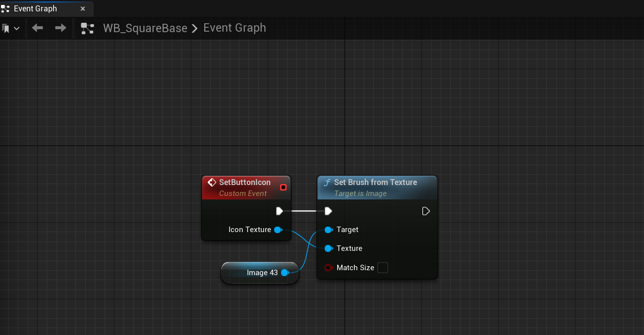
In order to dynamically change the icons for our square base buttons, we create a custom event SetButtonIcon with an input of type Texture 2D named "Icon Texture".
Next, we pass our event into a Set Brush from Texture node whose target is the image, followed by passing our icon texture input into the Set Brush from Texture node's Texture.
Again we had to set the placeholder image inside the button as a variable so we can manipulate it. We get the image and pass that into the set brush node' target.

Now in our landing page, we can just simply drag the button into its hierarchy.
In the landing page's blueprint we pre-construct again and call our SetButtonIcon event into which we pass our button as a target. Now we simply select the asset we would like to use once we have actually imported the asset.
![]()